MULTI-TENANT UI DESIGN SYSTEM, TOKEN STANDARDIZATION, AND FIGMA MIGRATIONmPulse Payor Platform
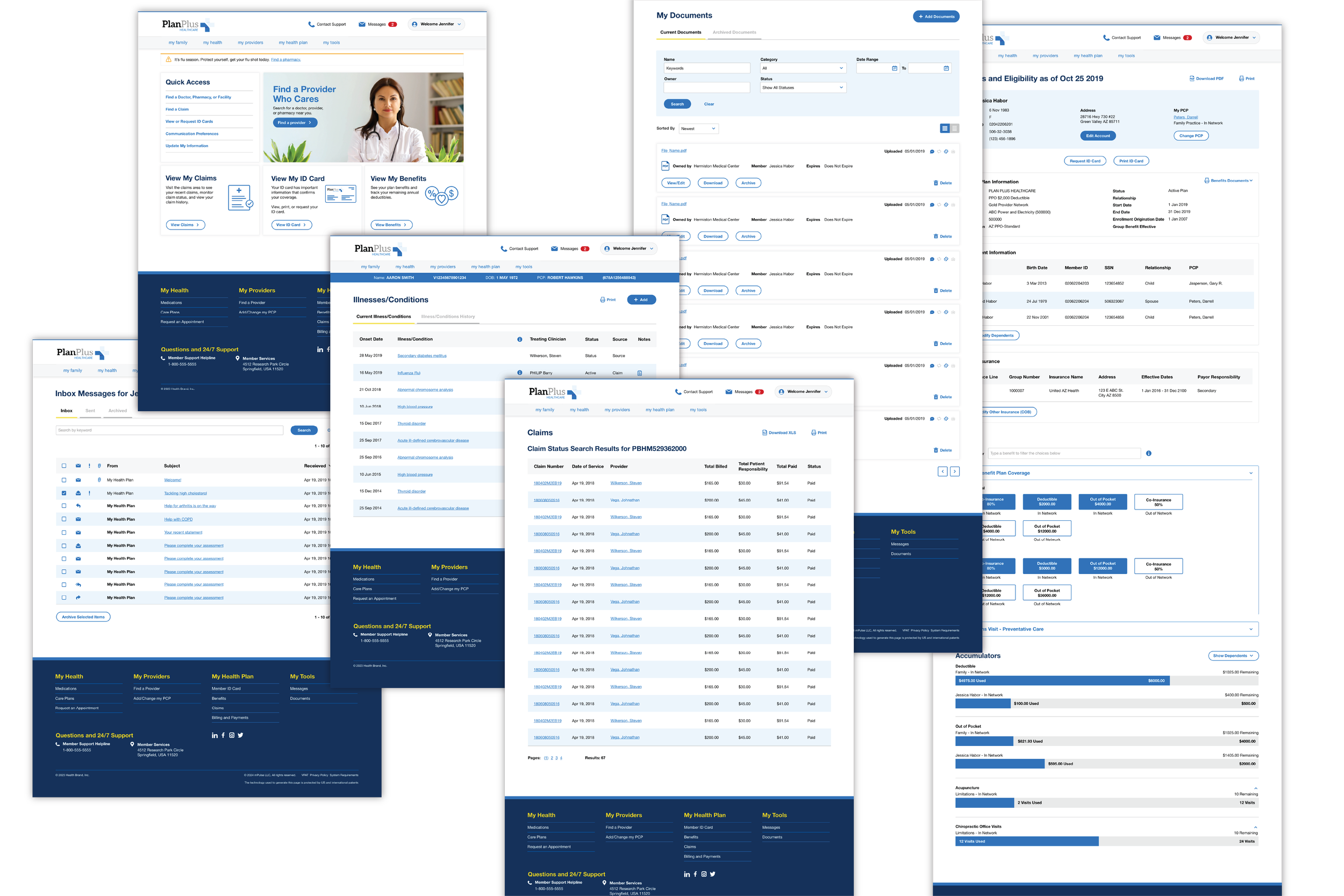
mPulse supports multiple health insurance organizations through a white-labeled member portal. As the product expanded, design inconsistencies across client implementations made it difficult to maintain visual cohesion and scale new payer experiences efficiently.
I led the design-side modernization of the platform's design infrastructure, including standardizing design tokens, building a comprehensive component library, and migrating the product design system from Sketch to Figma. This work established a scalable component structure that aligned with how engineering was building and deploying client implementations, enabling consistent theming while preserving individual client branding. The result was a shared design language between design and engineering that dramatically reduced implementation time and made it possible to scale concurrent client deployments.
Timeline
2022-2024
Role
Product Designer
Deliverables
Component Library
Design Token System
UI Inventory
Figma Design System Migration
Where We Began
When a C-suite leader called for faster, more scalable client implementations, my role was to translate that goal into a design system developers could actually build from. I go into detail about my contribution, and how good design infrastructure multiplies outcomes far beyond what any single designer can produce alone.
My Role
As the lone Product Designer, I worked collaboratively with the Director of Product Design and the UI development team. My contribution was the design-side foundation: inventorying the existing UI, defining the component library, and establishing the naming conventions and token structure that the engineering team would use to build and deploy across clients.
This project sat outside the work where I had full creative ownership. I didn't direct the initiative or set the strategy. What I did was show up to a messy, undefined problem and bring enough clarity to make it buildable.
The Problem
mPulse builds white-labeled member health portals for health payers. Each client gets a branded version of the same core product. Before this initiative, every new client implementation started largely from scratch on the development side. There was no shared component language between design and engineering, no reusable structure, and no system for applying brand variables, such as color, typography, and spacing efficiently across different clients.
The result was implementations that averaged 600 hours of engineering work per client. With a small team, that ceiling was low. Growth was effectively capped by the time it took to repeat the same work over and over.
The Insight That Came Out of a Debate
Early in the project, the team was working through how to name colors in the system. We debated whether to use literal color names, like "red".
I pushed for semantic, role-based naming: "primary," "secondary," "text," and "alert" so that they would work across every client. A token named "red" only makes sense for a client whose brand uses red, but a token named "primary" works for any client, regardless of their palette.
It was important to have a distinct naming system to create the infrastructure that would scale for every client, past and present.
How It Connected to Engineering
The component library fed directly into a Storybook-based development system built by the UI team. Where I defined the design tokens and component specs, the developers built the corresponding coded components that could be configured per client rather than rebuilt from scratch.
When a new client came on, applying their brand became a matter of updating token values -- primary color, secondary color, typography choices -- rather than redesigning and redeveloping a product from the ground up.
The Results
Implementation time dropped from 600 hours to 70 hours per client -- an 88% reduction
The team scaled from roughly 2 deployments per year to 25 concurrent implementations
Engineering saved an estimated 530 hours per client in redundant development work
Design consistency improved across all client portals, reducing QA burden and brand deviation
These outcomes belong to the whole team. My contribution was the design foundation that made them structurally possible.
What I Built
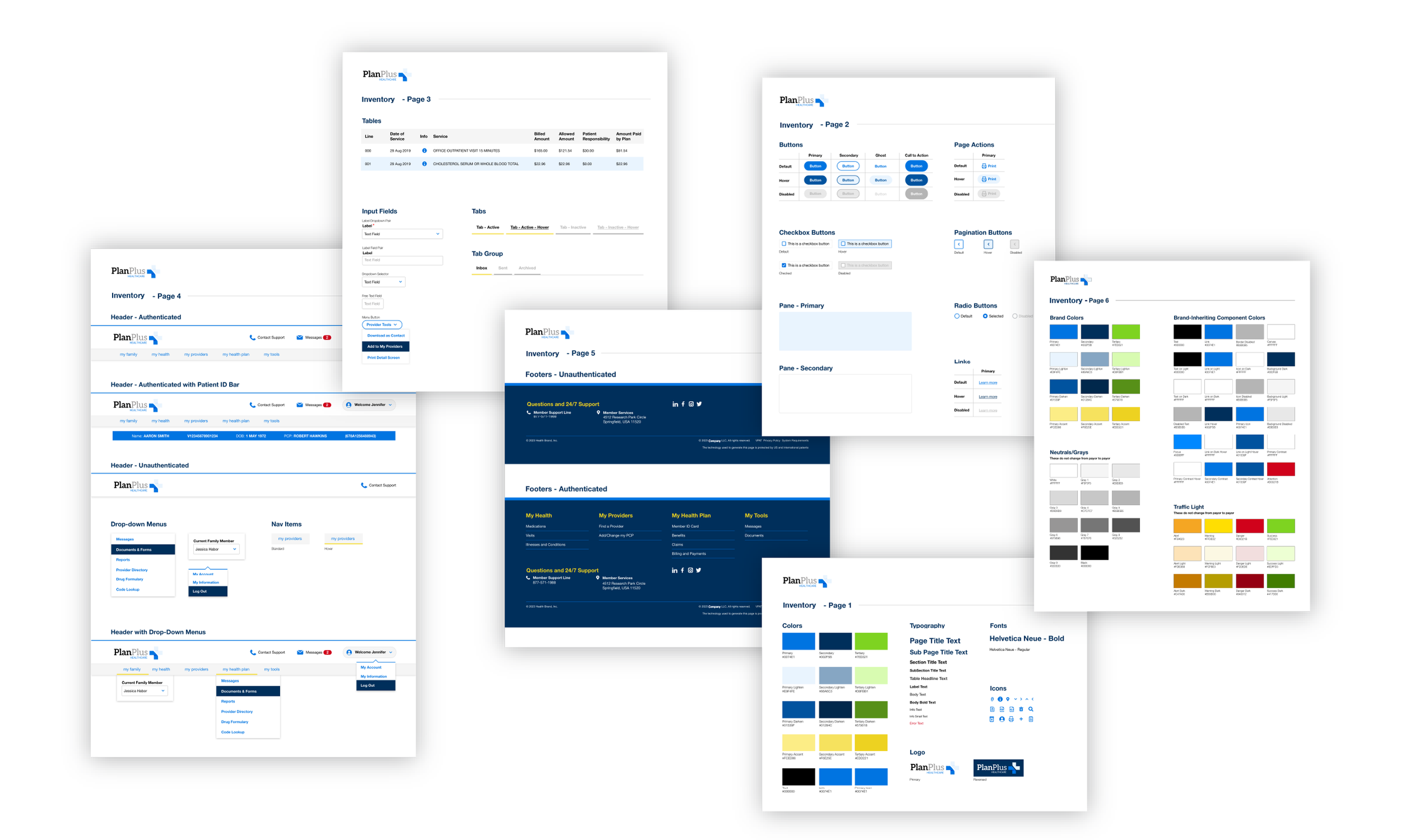
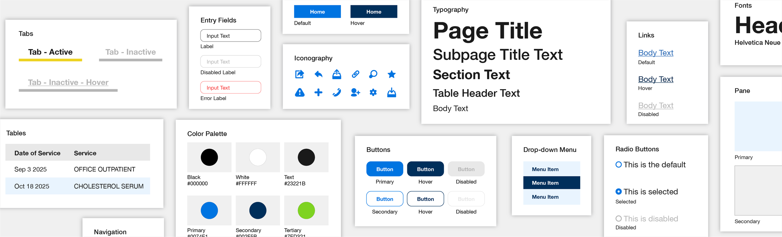
Working in Sketch alongside the UI team's Storybook implementation, I developed a comprehensive component library that documented and standardized the visual building blocks of the portal product. This included:
Color tokens with semantic, client-agnostic naming conventions
Typography scale defining hierarchy from page titles to body text
Component states for buttons, inputs, tabs, checkboxes, drop-downs, headers, footers, and navigation elements
Layout components including panes, tables, and pagination
A full UI inventory documenting existing elements before standardization, creating a clear before-state for the team to work from
Each component was documented with default, hover, active, disabled, and error states. The goal was to give developers a single, comprehensive source of truth that removed interpretation from the implementation process.